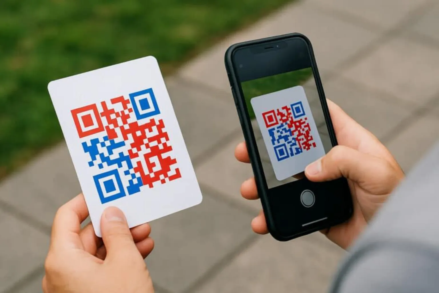
QR codes have evolved far beyond simple black-and-white squares. Today, businesses use branded QR codes on packaging, restaurant menus, marketing materials, product labels, event tickets, business cards, and digital campaigns. With customization tools becoming more advanced, many people ask the same question:
Can a QR code be any colour?
The short answer is yes—but there are important rules.
While QR codes can be customized with different colours, gradients, logos, and branding elements, poor colour choices can make them difficult or even impossible to scan. A visually appealing QR code is useless if users cannot scan it quickly.
In this guide, we'll explore how QR code colours affect scanning performance, why contrast matters, what happens with inverted QR codes, and the most common design mistakes that break QR code functionality.
Whether you're designing QR codes for marketing campaigns, product packaging, restaurants, retail stores, or business promotions, understanding these principles will help ensure your QR codes remain both attractive and functional.
Understanding How QR Code Scanners Work
Before discussing colours, it's important to understand how QR scanners read a QR code.
A QR code consists of:
- Data modules (the dark squares)
- Quiet zone (empty border around the code)
- Finder patterns (large squares in the corners)
- Alignment patterns
- Timing patterns
When a smartphone camera scans a QR code, the scanning software identifies the contrast between dark and light areas. It then analyzes the pattern and decodes the stored information.
The scanner does not understand "black" and "white" specifically.
Instead, it detects:
- Dark areas
- Light areas
- Contrast between them
This means a QR code does not have to be black and white to work successfully.
Can a QR Code Be Any Colour?
Technically, yes.
A QR code can be generated in almost any colour combination.
Examples include:
- Blue QR codes
- Green QR codes
- Red QR codes
- Purple QR codes
- Brand-coloured QR codes
- Gradient QR codes
- Gold QR codes
- Multi-colour QR codes
The critical requirement is that there must be sufficient contrast between the foreground and background.
A scanner must clearly distinguish the QR pattern from its background.
For example:
Good Colour Combinations
- Dark blue on white
- Dark green on cream
- Black on yellow
- Dark purple on white
- Navy on light grey
Poor Colour Combinations
- Yellow on white
- Light grey on white
- Light blue on white
- Red on orange
- Green on blue
In these cases, the contrast is too weak for many scanners to recognize the QR code consistently.
Why Contrast Matters More Than Colour
The biggest factor affecting QR code readability is contrast.
Contrast refers to the difference between the lightness and darkness of two colours.
High contrast helps scanners quickly identify:
- Finder patterns
- Alignment markers
- Data modules
Low contrast forces scanners to struggle with recognition.
Imagine trying to read grey text on a white page.
Even if the information is present, it becomes harder to see.
QR scanners face the same challenge.
Recommended Rule
Always use:
Dark foreground + Light background
This remains the most reliable configuration across:
- Android devices
- iPhones
- Older smartphones
- Third-party scanning apps
- Industrial scanners
The stronger the contrast, the better the scanning performance.
Best QR Code Colour Combinations
If you're creating a branded QR code, these combinations generally perform well.
Dark Blue on White
Popular among:
- Technology companies
- SaaS businesses
- Corporate brands
Benefits:
- Professional appearance
- Excellent scan reliability
Dark Green on White
Popular among:
- Eco-friendly brands
- Agriculture businesses
- Sustainability campaigns
Benefits:
- Strong readability
- Natural branding
Black on Yellow
Benefits:
- Extremely high contrast
- Fast recognition
Often used in:
- Industrial settings
- Warehouses
- Logistics operations
Dark Purple on White
Benefits:
- Premium appearance
- Reliable scanning
Popular among:
- Beauty brands
- Luxury products
Dark Brown on Cream
Benefits:
-
Works well for:
- Coffee brands
- Artisan products
- Organic packaging
Provides a unique look while maintaining good readability.
Can You Use Brand Colours in a QR Code?
Absolutely.
Many businesses customize QR codes to match their visual identity.
Examples:
- Retail stores
- Restaurants
- Event organizers
- Real estate companies
- E-commerce brands
Brand-coloured QR codes often attract more attention than generic black-and-white versions.
However, branding should never come at the expense of usability.
A good rule is:
Brand first, but scanability always comes first.
Before publishing a QR code:
- Test on multiple phones
- Test under different lighting conditions
- Print at actual size
- Scan from different distances
If scanning becomes inconsistent, adjust the colours.
What Is an Inverted QR Code?
An inverted QR code reverses the traditional colour arrangement.
Traditional QR Code:
- Dark modules
- Light background
Inverted QR Code:
- Light modules
- Dark background
For example:
- White QR code on black background
- Yellow QR code on navy background
- Light grey QR code on dark blue background
These designs are visually striking and commonly used in premium branding.
However, they introduce scanning risks.
Do Inverted QR Codes Work?
Sometimes.
Modern smartphones have improved dramatically and can often read inverted QR codes.
However, compatibility varies.
Factors include:
- Device model
- Camera quality
- Scanning software
- Lighting conditions
An inverted QR code that scans perfectly on one device may fail on another.
This creates a user experience problem.
If customers cannot scan immediately, many simply give up.
For business-critical applications, reliability should always take priority over visual style.
When Inverted QR Codes Usually Fail
Inverted QR codes become problematic when combined with other design choices.
Examples include:
Low Contrast
White on light grey.
Light yellow on beige.
Silver on white.
These combinations reduce visibility.
Small Print Sizes
Smaller QR codes already contain limited detail.
Inversion makes recognition even harder.
Poor Lighting
Dark environments reduce camera performance.
Inverted QR codes often suffer more than traditional designs.
Reflective Surfaces
Examples:
- Glossy packaging
- Metal surfaces
- Laminated cards
Reflections interfere with scanner recognition.
Low-Quality Printing
Blurred edges significantly affect inverted QR code readability.
The Science Behind QR Code Contrast Ratios
Although there is no single universal contrast ratio requirement, higher contrast generally improves performance.
A scanner interprets image brightness rather than colour names.
For example:
Good:
- Black on white
- Navy on white
- Dark green on cream
Poor:
- Yellow on white
- Light blue on grey
- Pink on white
The greater the brightness difference, the easier the scan.
This principle applies whether the QR code is displayed:
- On paper
- On screens
- On packaging
- On billboards
- On product labels
Real-World QR Code Testing ResultsAt FastQR, we've found that the biggest scanning problems rarely come from the QR code itself. Instead, they usually happen after customization.
For example, a restaurant may replace a standard black QR code with a light gold design to match its menu branding. While the code looks attractive, customers often struggle to scan it under dim lighting conditions.
Similarly, businesses using QR codes on glossy packaging sometimes experience reduced scan rates because reflections interfere with camera recognition.
In most cases, improving colour contrast and maintaining a clear quiet zone solves the problem immediately.
This is why every custom QR code should be tested on multiple devices before launch.
Why this helps: Google sees experience-based content instead of generic explanations.
Common QR Code Design Mistakes That Break Scanning
Many QR codes fail not because of colour alone but because of multiple design errors.
1. Low Contrast Colours
This is the most common mistake.
Examples:
- Light grey on white
- Yellow on cream
- Orange on pink
The QR code may look attractive but become difficult to scan.
2. Removing the Quiet Zone
The quiet zone is the blank border surrounding a QR code.
Without sufficient white space, scanners struggle to detect boundaries.
Never crop this area.
3. Excessive Logo Size
Adding a logo can improve branding.
However, oversized logos cover important data modules.
Even with error correction, too much obstruction causes failures.
4. Extreme Gradients
Gradients can look modern.
But aggressive colour transitions create inconsistent contrast.
Subtle gradients are usually safer.
5. Poor Print Quality
Blurry printing affects:
- Finder patterns
- Alignment patterns
- Module definition
Always print using high-resolution files.
6. Tiny QR Codes
If users cannot capture enough detail, scanning becomes unreliable.
Recommended minimum size:
- At least 2 cm × 2 cm for simple QR codes
- Larger for longer URLs
7. Busy Backgrounds
Placing QR codes over:
- Photographs
- Patterns
- Textures
creates recognition challenges.
Use a clean background whenever possible.
8. Transparent QR Codes
Transparent elements often disappear against certain backgrounds.
This creates inconsistent performance.
Solid colours are generally safer.
Are Gradient QR Codes Safe?
Gradient QR codes have become increasingly popular.
Examples:
- Blue-to-purple
- Green-to-blue
- Orange-to-red
They can work well if:
- Contrast remains strong
- Finder patterns remain visible
- The background stays light
Problems occur when both ends of the gradient become too light.
Always test thoroughly before deployment.
QR Code Colour Best Practices for Businesses
Businesses should follow these guidelines:
Use Dark Foreground Colours
Examples:
- Black
- Navy
- Dark green
- Dark purple
Keep Backgrounds Light
Examples:
- White
- Light grey
- Cream
Maintain High Contrast
Contrast improves:
- User experience
- Scan speed
- Device compatibility
Test Across Devices
Check:
- Android phones
- iPhones
- Older devices
Print Before Launching
Digital previews do not always reveal scanning issues.
Real-world testing matters.
Avoid Experimental Designs for Critical Applications
If a QR code is used for:
- Payments
- Product authentication
- Restaurant menus
- Event access
prioritize reliability over aesthetics.
Does QR Code Colour Affect Scan Speed?
Yes.
A well-designed high-contrast QR code typically scans faster.
Benefits include:
- Faster camera recognition
- Better user experience
- Higher conversion rates
In marketing campaigns, even a small improvement in scan success can increase engagement.
A QR code that scans instantly removes friction from the customer journey.
How FastQR Helps Create Reliable Custom QR Codes
Many businesses want QR codes that look professional while maintaining excellent scan performance.
With FastQR, users can:
- Create custom QR codes
- Apply brand colours
- Add logos
- Generate high-quality downloadable files
- Design QR codes for print and digital use
The key advantage is balancing visual branding with scanning reliability.
Before publishing any QR code, businesses should always test their final design in real-world conditions to ensure maximum performance.
Final Thoughts
So, can a QR code be any colour?
Yes—but colour alone doesn't determine whether a QR code will work.
What truly matters is contrast.
A dark foreground combined with a light background remains the safest and most reliable approach. While coloured, branded, gradient, and even inverted QR codes can work successfully, every design should be tested across multiple devices and environments before being published.
The goal is not simply to create a beautiful QR code. The goal is to create a QR code that people can scan instantly and effortlessly.
When design and functionality work together, QR codes become powerful tools for marketing, customer engagement, payments, product information, and business growth.
If you're creating branded QR codes, always remember:
A stylish QR code that doesn't scan is a failed QR code. A well-designed QR code that scans every time is a successful one.
Frequently Asked Questions (FAQ)
1. Can a QR code be any colour?
Yes. QR codes can use almost any colour combination as long as there is sufficient contrast between the foreground and background.
2. What colour QR code scans best?
Black on white remains the most reliable combination because it provides maximum contrast.
3. Do inverted QR codes work?
Many modern smartphones can scan inverted QR codes, but they are generally less reliable than traditional dark-on-light QR codes.
4. Can I use my brand colours in a QR code?
Yes. Brand colours can be used successfully if the contrast remains strong and the QR code is thoroughly tested.
5. Why is my coloured QR code not scanning?
Common causes include low contrast, poor printing quality, insufficient quiet zone, oversized logos, or complex backgrounds.
6. Are gradient QR codes safe to use?
Gradient QR codes can work well when the contrast remains strong across the entire design.
7. Does QR code colour affect scanning speed?
Yes. Higher contrast QR codes are typically recognized faster by scanning devices.
8. What is the best background colour for a QR code?
White, light grey, or cream backgrounds usually provide the best scanning performance.